Monday, December 10, 2012

The Pantone Color of the Year is EMERALD GREEN!

I predicted it!!!

I predicted about two weeks ago that Pantone's Color of the Year would be Sapphire Blue or Emerald Green--and I was right!!!

Pantone made the announcement this week: PANTONE 17-5641 Emerald, a lively, radiant, lush green, is the Color of the Year for 2013.


Green happens to be my favorite color and I adore the shade of Emerald Green. It's rich, energizing and regal!

It just so happens that jewel tones look good with my coloring and skin tone--bonus!! I have "Emerald Green ANYthing!" on my Christmas list this year. I'm hoping for a sweater, scarf and, of course, jewelry!

It really is a gorgeous color and you WILL be seeing it everywhere in 2013!

Do you love it or hate it?? How could you see yourself incorporating it into your home, business, wardrobe or life in 2013??


Wednesday, October 17, 2012

Introducing...House of Turquoise!

If you are like me and love to see inside gorgeous, fresh, bright, inviting interiors {and especially if you love the color turquoise!}, you will love this website!

It's called House of Turquoise and it's run by a professional blogger who gathers all the best home design and decor images from around the web and showcases them on her blogs. This site is my favorite because it always features homes with turquoise in it, and it is definitely eye candy!!

Today I met Camille Roskelley, a fabric and quilt designer with a talent for home decorating!

The entire tour of her home is absolutely delightful and her paint color scheme is PERFECT! She tells the paint colors and other sources at the end of the post! Check it out HERE.

She also has a beautiful blog called Simplify and is the author of a book called "Simplify with Camille Roskelley: Quilts for the Modern Home," here on Amazon.

Now I'm going to find out how to get my hands on some of Camille's fabrics....
Do you want YOUR home to have a beautiful flow of paint colors from room to room??
Hire Me!.

Thursday, October 4, 2012

Think PINK in October!

October is Breast Cancer Awareness Month!

Pink is a very flattering color for painting your walls. A dark shade can be very dramatic while a very pale pink can give a room a very subtle glow without screaming 'pink.'

Check out this stunning sitting room! VERY dramatic and elegant!

Source: google.com via Sabina on Pinterest

And this lovely dining area with an 'old world' feel.


Pink is delightful for a woman's home office, too.


Where would YOU consider using PINK in your home??
If you want me to help you pick the perfect shade of PINK for your home, Hire Me!.

Monday, September 24, 2012

Kitchen Makeover: Paint Your Cabinets!

Want a simple, affordable and DRAMATIC way to give your entire kitchen a makeover??

Let OnaMission Home Painting paint your kitchen cabinets!

This is our client, Dawn's, BEFORE photo.


And this is the AFTER!


She got new granite counter tops, too. Gorgeous!

This project look about a week from start to finish.

Painting your cabinets would be a great way to perk up your kitchen before the holidays!


Thanks, Dawn, for sharing your beautiful pictures!

If you want help coloring your world, Hire Me!.

Saturday, September 15, 2012

Take the Homegoods Stylescope Quiz!

The NEW Homegoods Stylescope quiz is so fun and simple. You pick FIVE images that appeal to you and it assigns you one of twelve styles.

Take the quiz HERE.

My decorating style actually came up as 'Farmhouse Glam' (below) which is spot ON! I love the mix of fancy and comfortable. The pearls and the lavender are two of my loves!

Farmhouse Glam is described as "the delicate, exquisite balance between beautiful femininity and rustic nonchalance. She's all about the discovery of unexpected sparkle amidst the less polished. She wears high heels and a denim jacket, a string of pearls and bare feet. And her home feels as special as it does comfortable." YES!

Source: awe.sm via Tabitha on Pinterest

This is the style in action (and, yes, I adore it!):


This one is 'The Traveler' (below). Isn't it exotic?? I love the colors and textures! It appeals to me for sure but I don't know if I could live with those BOLD colors EVERY day.


I won't ruin the surprise of discovering the rest of them for yourself.

If you take the quiz, let me know what yours turns out to be and if you agree!


You can even let us know on the OnaMission Home Painting Facebook Page!

And remember...if you want help coloring your world, Hire Me!.

Thursday, September 13, 2012

Fall Color Preview

Fall color preview! This is for fashion, but certainly works for adding color to your HOME as well!

I'm loving the coffee-brown, the clear blue and the soft lilac. The green, gray and pink are lovely, too! OK, they're ALL fantastic! {I love color!}
 
Source: pantone.com via Jeani on Pinterest

If you want help coloring your world, Hire Me!.

Tuesday, August 28, 2012

I'm back!

I'm baaaa-aaaack!!

I recently joined the Gilbert Chamber of Commerce for my writing business and I'm attending a Tuesday morning referral group with my Dad so now I get to hear first hand all about what he's up to and what questions people are asking him.

I'm also starting to run his Facebook business page for him (give us a 'like' if you haven't already!), so I'm back in the throes of paint, color and home design. I love it!

It's almost September and my mind turns to fall. I'm itching to get my fall decor back out!


In the meantime, I'm loving this palette. It's "Global Spice" by HGTV for Sherwin Williams. Lots of nice neutrals and fun jewel tones, too, that can easily be added to your home's current colors for a little added pizazz.

What colors make YOU think of fall?

Monday, March 5, 2012

Color of the Year: Tangerine Tango

Pantone declared that the color of 2012 is...TANGERINE TANGO.


It's described as a "vivacious and appealing reddish orange."

Here are some ideas from deigner Samantha Friedman for adding it to your home:


I LOVE the color! I adore the color turquoise and one of my favorite colors to pair it with is orange. Such a great combo!


You've probably already seen it, too, for spring: orange with navy blue or gray. It's H-O-T, HOT! I hope you'll add some to your home or wardrobe!

If you want help coloring your world,

Hire Me!.

Thursday, February 9, 2012

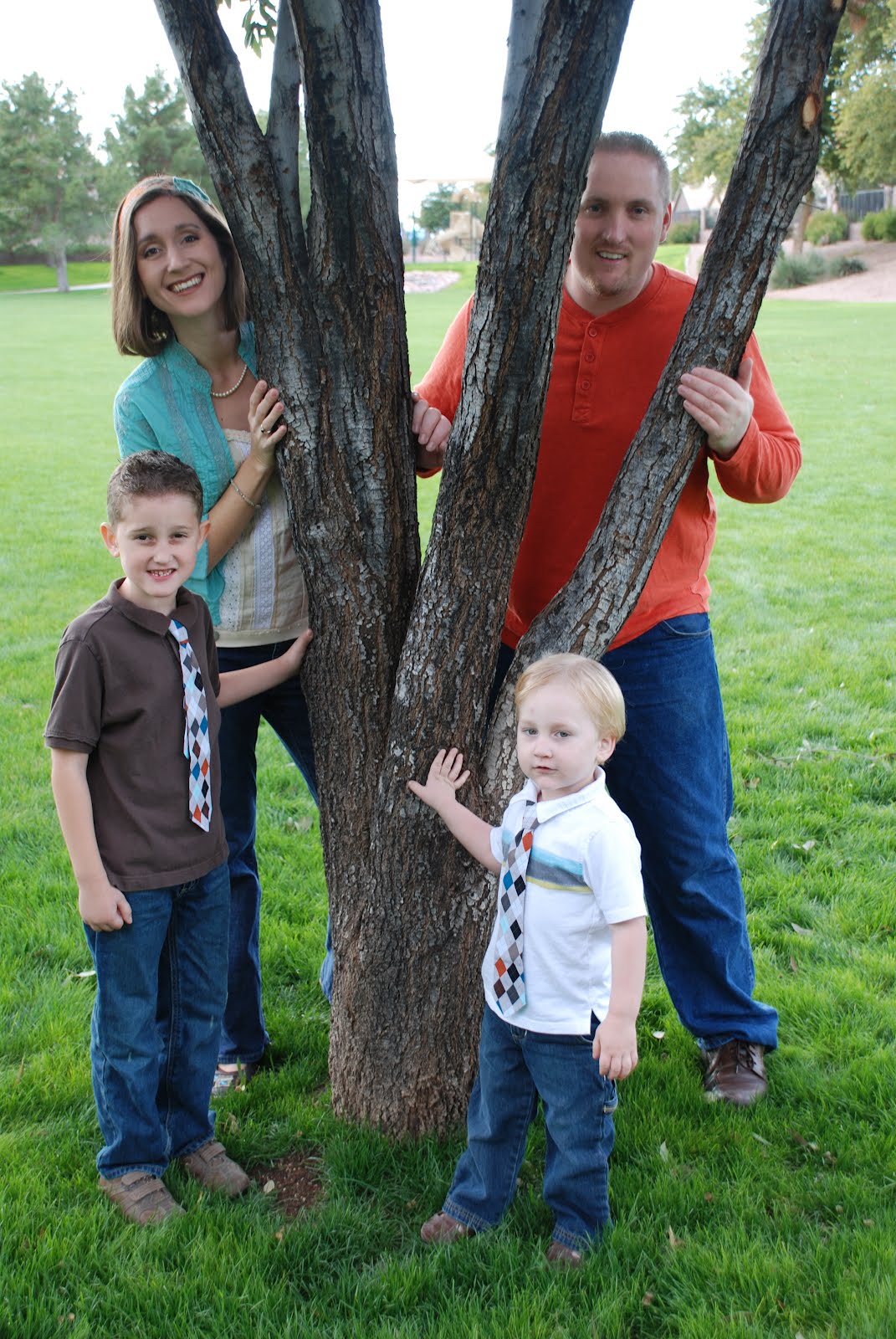
Colors I chose for our family photo

The "look" of our family photos every year is a big deal to me! I usually have a "vision" of what I want and this year was no different.

I saw the adorable ties the boys are wearing at a local craft fair and made them the jumping-off point for our pictures this year. I decided on a turquoise, orange and brown color scheme. Blue jeans are casual...and we all had pairs that looked good together!


I found the headband at the same craft fair. I got the tank and blouse at a local consignment store (I took the headband with me to make sure it all "went"). I love the green grass in the background...and the monkey!


And I thought our cards turned out beautifully--and exactly how I envisioned them!


I love it when a plan comes together!

If you want help coloring your world, Hire Me!.

Thursday, October 20, 2011

Benjamin Moore's Paint Color of the Year!

Whythe Blue, HC-143!


From the Benjamin Moore web site: "We have chosen wythe blue (HC-143) as Benjamin Moore’s 2012 Color of the Year. It’s a beautiful, calming hue that has an element of heritage that offers grounding rootedness, providing comfort and stability."

It's from the "Earth & Sky" palette {which I loooove}:


These are TWO versions of the same dining room, showcasing the "Earth & Sky" palette. Notice the ceiling, trim and accent colors, too.


{dining room #1, version 1}


{dining room #2, version 1}


{dining room #1, version 2}


{dining room #2, version 2}

Here are close-ups of the other colors in the "Earth & Sky" palette:


{sharkskin}


{fresh olive}


{battenberg}


{storm cloud gray}

Explore more of the Earth & Sky Palette HERE and see the behind-the-scenes details of the above dining room transformation.

Want some beautiful Wythe Blue eye candy?? Check out a slew of amazing images on House of Turquoise HERE and HERE.

Want help taking the SCARY out of choosing colors?? Hire Me!.

Sunday, October 2, 2011

Adding FALL color to your home and wardrobe

It's still over 100 degrees in the Phoenix, Arizona valley so, despite the Halloween wreath on my door and cinnamon candle I'm burning in the kitchen, it doesn't really FEEL like fall yet.

So far, all I've done to ring in fall is to spruce up my outdoor space with some new pillows. I scored these for $5 on clearance at Fry's Marketplace. They're "my colors:" turquoise, green and brown.


See the candleholder on the white table? My friend got me that for a housewarming gift and it's perfect! It won't be long before we start using my fabulous fire pit. Can't wait for hotdogs and s'mores!


I AM I am loving all the fun, new fall colors I'm seeing, though!

If you're like me, you're looking for fun ways to add some new colors into your life.

This Mary Kay flyer arrived in the mail and had me swooning for the "rich jewel tones, equestrian browns, woodsy berries and icy pastels."


{image from the 9/11 Mary Kay "the look" catalog}

If you haven't updated your makeup bag in a while, think about snagging a few new eyeshadow or lip colors to freshen your look. You might be surprised at how many compliments you get just from wearing a new shade of lipstick!

If you need a Mary Kay rep, my dear old friend and mentor, Wilma, will help you (and she ships orders all over the U.S.--FAST!). Visit her personal web site HERE.

I also noticed that the Pantone's Fall 2011 Fashion Color Trend Report reflects many of the same colors. They describe them as "Sensible & Spirited."


{image source: Pantone}

To discover more about Pantone's fall colors and to play with the above colors, visit Pantone's web site HERE.

These are some fun paint colors I pulled out that went well with the above palette. Besides painting a room or an accent wall, think about painting a piece of furniture, some thrift store picture frames or a bench for your front porch.

For the pink..."Vivacious Pink" #122 by Sherwin Williams


For the blue-gray..."Languid Blue" #33 by Shwerin Williams


For the teal..."Maxi Teal" #6769 by Sherwin Williams


And if you're into yellows and golds..."Quilt Gold" #6696 by Sherwin Williams


This entire "Color Pizazz" collection by HGTV by Sherwin Williams is chock full of amazing fall colors that are "IN" this year. They are GORGEOUS.


Not quite ready to paint?

Looking for ways to add trendy fall color to your life without a big commitment?

Perhaps you can just paint your nails??

Louvre Me, Louvre Me Not by OPI

Or how about a pillow on your couch?

{teal pillow from Target}

Maybe a new handbag? {did you know that handbags are IN this year? It's true!}


{Rosetti snakeskin tote in "Rose" from Kohl's}

Perhaps some kitchen dishtowels?

{Crate and Barrel}

This, by the way, is my favorite HOT new fall color, AUBERGINE, exemplified in this...


{Fionn Aubergine Velvet Chair} from Pier 1.

If I were up for painting an entire wall, I'd go this direction (probably in the guest bathroom). So dramatic!


{"Fablous Grape" #6293 by Sherwin Williams} Swoooooon.

So far all I've done is paint my toenails an almost-black green color and purchased a new black top. I need to take my own advice and step out of the box!!

How are YOU embracing the hip colors of fall?

Choosing color doesn't have to be SCARY anymore if you... Hire Me!