Thursday, October 4, 2012

Think PINK in October!

October is Breast Cancer Awareness Month!

Pink is a very flattering color for painting your walls. A dark shade can be very dramatic while a very pale pink can give a room a very subtle glow without screaming 'pink.'

Check out this stunning sitting room! VERY dramatic and elegant!

Source: google.com via Sabina on Pinterest

And this lovely dining area with an 'old world' feel.


Pink is delightful for a woman's home office, too.


Where would YOU consider using PINK in your home??
If you want me to help you pick the perfect shade of PINK for your home, Hire Me!.

Monday, September 24, 2012

Kitchen Makeover: Paint Your Cabinets!

Want a simple, affordable and DRAMATIC way to give your entire kitchen a makeover??

Let OnaMission Home Painting paint your kitchen cabinets!

This is our client, Dawn's, BEFORE photo.


And this is the AFTER!


She got new granite counter tops, too. Gorgeous!

This project look about a week from start to finish.

Painting your cabinets would be a great way to perk up your kitchen before the holidays!


Thanks, Dawn, for sharing your beautiful pictures!

If you want help coloring your world, Hire Me!.

Saturday, September 15, 2012

Take the Homegoods Stylescope Quiz!

The NEW Homegoods Stylescope quiz is so fun and simple. You pick FIVE images that appeal to you and it assigns you one of twelve styles.

Take the quiz HERE.

My decorating style actually came up as 'Farmhouse Glam' (below) which is spot ON! I love the mix of fancy and comfortable. The pearls and the lavender are two of my loves!

Farmhouse Glam is described as "the delicate, exquisite balance between beautiful femininity and rustic nonchalance. She's all about the discovery of unexpected sparkle amidst the less polished. She wears high heels and a denim jacket, a string of pearls and bare feet. And her home feels as special as it does comfortable." YES!

Source: awe.sm via Tabitha on Pinterest

This is the style in action (and, yes, I adore it!):


This one is 'The Traveler' (below). Isn't it exotic?? I love the colors and textures! It appeals to me for sure but I don't know if I could live with those BOLD colors EVERY day.


I won't ruin the surprise of discovering the rest of them for yourself.

If you take the quiz, let me know what yours turns out to be and if you agree!


You can even let us know on the OnaMission Home Painting Facebook Page!

And remember...if you want help coloring your world, Hire Me!.

Thursday, September 13, 2012

Fall Color Preview

Fall color preview! This is for fashion, but certainly works for adding color to your HOME as well!

I'm loving the coffee-brown, the clear blue and the soft lilac. The green, gray and pink are lovely, too! OK, they're ALL fantastic! {I love color!}
 
Source: pantone.com via Jeani on Pinterest

If you want help coloring your world, Hire Me!.

Tuesday, August 28, 2012

I'm back!

I'm baaaa-aaaack!!

I recently joined the Gilbert Chamber of Commerce for my writing business and I'm attending a Tuesday morning referral group with my Dad so now I get to hear first hand all about what he's up to and what questions people are asking him.

I'm also starting to run his Facebook business page for him (give us a 'like' if you haven't already!), so I'm back in the throes of paint, color and home design. I love it!

It's almost September and my mind turns to fall. I'm itching to get my fall decor back out!


In the meantime, I'm loving this palette. It's "Global Spice" by HGTV for Sherwin Williams. Lots of nice neutrals and fun jewel tones, too, that can easily be added to your home's current colors for a little added pizazz.

What colors make YOU think of fall?

Monday, March 5, 2012

Color of the Year: Tangerine Tango

Pantone declared that the color of 2012 is...TANGERINE TANGO.


It's described as a "vivacious and appealing reddish orange."

Here are some ideas from deigner Samantha Friedman for adding it to your home:


I LOVE the color! I adore the color turquoise and one of my favorite colors to pair it with is orange. Such a great combo!


You've probably already seen it, too, for spring: orange with navy blue or gray. It's H-O-T, HOT! I hope you'll add some to your home or wardrobe!

If you want help coloring your world,

Hire Me!.

Thursday, February 9, 2012

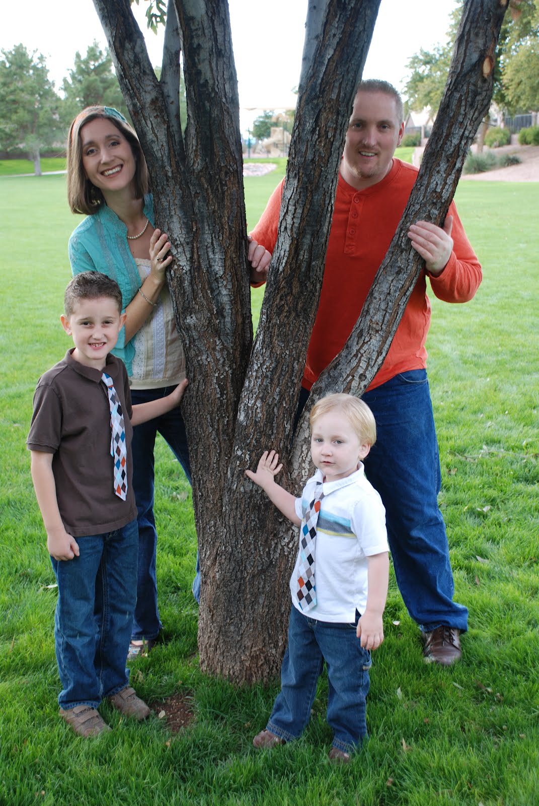
Colors I chose for our family photo

The "look" of our family photos every year is a big deal to me! I usually have a "vision" of what I want and this year was no different.

I saw the adorable ties the boys are wearing at a local craft fair and made them the jumping-off point for our pictures this year. I decided on a turquoise, orange and brown color scheme. Blue jeans are casual...and we all had pairs that looked good together!


I found the headband at the same craft fair. I got the tank and blouse at a local consignment store (I took the headband with me to make sure it all "went"). I love the green grass in the background...and the monkey!


And I thought our cards turned out beautifully--and exactly how I envisioned them!


I love it when a plan comes together!

If you want help coloring your world, Hire Me!.